

Knight Lab
How a novel mobile app concept could help users explore interest-based communities in a new city.
As part of the class entitled "Design for Local News," my team partnered with Northwestern's Knight Lab: the innovative media maker lab at the intersection of journalism and design. Our project was a mobile app concept called Arrived that helped users find and join interest-based communities in a city they recently moved to.
Date: Mar 2020 - Jun 2020
Team: Chris Baggott, Lucy Hu, Zheng Tian
Skills Used and Developed:
-
UI/UX Design
-
Wireframing
-
Persona Development
-
Figma
-
Adobe XD
-
Service Blueprinting
-
Copywriting
Challenge
Design and test a mobile app concept to help locals find and join interest-based communities, build relationships, and ease the transition of moving to a new city.
Research & Foundations
The primary goal was the following: provide accessible entry points for young professionals looking to join interest-based communities. The team drew on existing user research done by another student group, and we worked on translating the user needs and design directions into an actual working prototype. Below I have singled out some quotes representing the foundational research findings:
"I'm too busy to do all the searching myself, and I'm not even confident I would find the right options."
"I need help taking the first step."
Our app concept would provide all of the logistical and practical information about how to find, select, and connect with interest-based communities, while giving users the confidence that they would find the community best suited to them. Our initial steps included persona creation and the collection of analogous services and design patterns for inspiration. We carefully developed a detailed story for our core user, whom we identified as a young professional and recent college graduate starting a job in a new city. The survey of existing solutions helped us take inspiration from social platforms like Meetup and Facebook Groups, as well as the inclusion of reviews and recommendations from services like Yelp and Tripadvisor.


Target user persona information (left) and design pattern inspiration board (right)
Pre-Design Work
The team then focused on the development and prioritization of features. Once we had brainstormed features and determined which ones were the most important, we used a simple service design blueprint to organize tasks, touchpoints, and features, and to visualize how the organization of the screens would support these tasks. This preliminary work encouraged me to think critically about the core features, and got me starting to imagine how the visual design of the app would support the user's most important tasks.


Snapshots of feature prioritization (left) and service design blueprint (right)
Early Visual Design
Once we had come up with our features, we started to sketch out how our app, called Arrived, would actually look. We split up the user journey into discrete steps such as "onboarding," "search," and "event registration." Then, we divided up the sketching work among the team members. This step was crucial because it brought our team from thinking about lists of features on paper to actually putting them on a "screen."
We even made a set of wireframes in Figma based solely on the sketches we did on paper. This provided a basic skeleton onto which we could build our actual screen designs.


Digital Prototyping
The team used Figma and Adobe XD to build prototypes, starting with low-fidelity black-and-white screens and moving to a more realistic user interface with colors, pictures, and more sophisticated motion design. This was a collaborative process within the team, and I took the lead on the onboarding process. The screens below show some comparisons of various hand-drawn screens to mid-fidelity screens.

An evolution of our team's early prototypes showing side-by-sides of paper and black-and-white

User Testing
The final stage of the project was the refinement of the prototype through user testing. We conducted four different rounds of testing with three users to iterate, improve, and strengthen our concept as we moved from low to high-fidelity prototypes.
Initial testing focused on validation of the core concept, as well as understanding user expectations of the content, layout, and organization of the screens and the general information that we should make available. Later testing moved into the ability of users to perform specific tasks with confidence, as well as honing the look and feel of the screens and the transitions between them.
A Closer Look
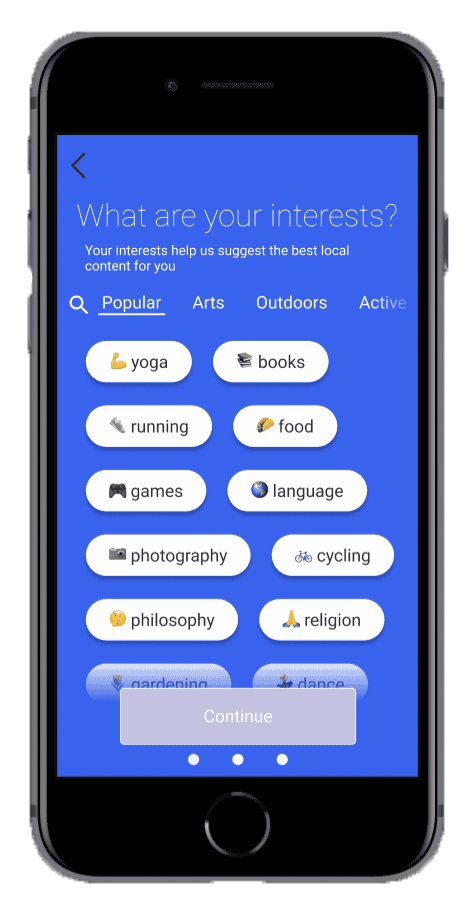
The benefits of multiple rounds of user testing and feedback were we could easily diagnose problems with our concept and make improvements. One example I will illustrate here is the selection of a user's interests, which is a subset of the onboarding process. This proved to be one of my more difficult interactions, and I went through multiple phases of improvement, starting with our mid-fidelity "first attempt" and evolving into my final concept while fixing various issues along the way. A summary of the steps in this process, along with snapshots of the prototype screens, are shown below.

Results
The team's final primary deliverable was a high-fidelity clickable prototype. Our final app concept was a Figma prototype with over fifty screens, all linked by transitions. The screens allowed a user to complete a variety of tasks including onboarding, exploring the home screen, browsing for groups, and event registration.
We presented the prototype to a panel of faculty for critique. The reactions were positive, particularly praising the visual design and user-friendly navigation. Our test users also gave us positive feedback along the way and liked our unique approach to community-building with a mobile app.

My Key Learnings
Always Remember the Task: This was a game-changer. The professors gave us some key advice when we were in the middle of prototyping and having some struggles with consistency in our interface. They told us to forget the visual design for a moment and really focus on the underlying task and the intent of the user. What, exactly, are they trying to do? How do they anticipate doing it? By taking time to answer these questions, we could make more informed decisions about how the interface was designed and not get caught up in novelties or the "cool" factor while prototyping.
The Importance of Familiarity: I learned how critical it is to include familiarity in an app design when testing with users. With all the design patterns we have all around us, mobile users bring lots of expectations when they encounter a new product. It was important for us to consider these expectations and include familiar patterns in the interface so even first-time users would feel a sense of control and not be surprised or lost.